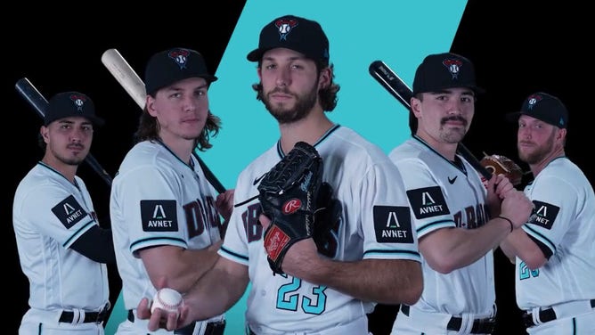
This 2023 Arizona Diamondbacks Jersey Patch Is Possibly The Worst One Yet
If you woke up today wondering how a professional sports team could take something relatively simple and make it unbelievably painful, look no further than the crack marketing folks for the Arizona Diamondbacks.
And, if you do choose to look, make sure your lunch is settled and you're not holding anything fragile.
Yeah, whatever you think, Diamondbacks!
MLB jersey patches look horrible, and the Diamondbacks are just the latest
Well, there you have it. Pitchers and catchers haven't even reported yet and we already have our early leader for dumbest design of 2023.
I mean, what are we doing here? Why are those patches so BIG?! And why are they just giant black blocks?
It looks like something I had on my little league jersey back in 2005, but that was fine because, you know, it was little league. This is the big leagues!
Someone got paid to place that eyesore on everyone's sleeves, and thought, 'You know what? This is it. This looks good. We did it.'
Shockingly, Twitter had an absolute field day with this one.
I scrolled through all the comments, all the quote tweets, and I've gotta be honest with you ... I didn't find one positive response. Nothing. Nada.
This swing-and-a-miss is the third patch unveiling we've seen so far, and I think they've all gotten progressively worse?
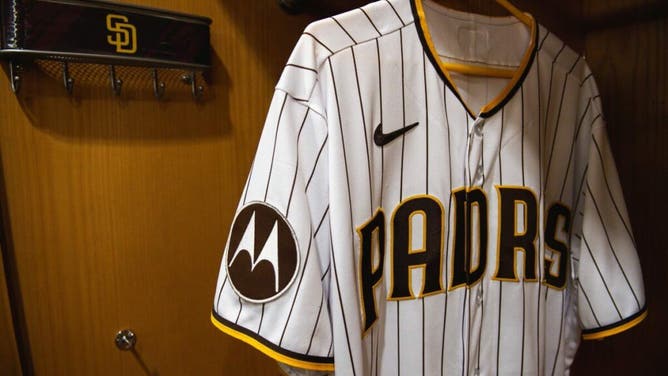
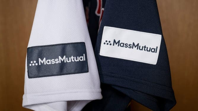
The San Diego Padres showed off these beauties last fall, and then the Red Sox proudly displayed their Mass Mutual patches right before Christmas. ,
So, which of the three sucks the most? Tough call, I know. I think the D-Backs take it, though.