Nike Unveiled Its New NBA 'City Retro' Jerseys And They Are Atrocious
This is why we can't have nice things.
Nike just released its NBA 'City Retro' alternate jerseys and fans are not impressed.
The jerseys that look like somebody got high and delved into a version of Windows 2000 MS Paint will be part of the NBA's upcoming "In-Season Tournament" that nobody asked for and include these jerseys that also nobody cares about.
LET'S TAKE A LOOK

CITY RETRO JERSEYS ARE AWFUL
I didn't mind when the NBA initially launched the third alternate jerseys but we've now gone so far beyond that. You'd think they would have learned when OutKick officially called out how bad some of the original jerseys were in 2020!
Currently each NBA team has five jerseys: Association, Icon, Statement, City and Classic. Do you think I know the difference between any of them? Absolutely not. Just give me the damn real home/away jersey and let's call it a day.
But alas as with everything these days it appears Nike is trying to get as much money as possible by releasing yet another line of City jerseys. Tough luck for anyone who purchased last years.
LET'S TAKE A LOOK...
The jerseys are a mixture of anything and everything it seems despite in many instances not even being able to tell which team it's supposed to represent.
Here we have the Denver Nuggets with a jersey that looks like someone is running a damn marathon. Honestly I know that 303 is the Denver area code (shout out to the music group 3OH!3) but I had to google what 5280 meant. Apparently it's the number of feet in a mile (sorry for the overseas fans that use meters) and because Denver is the 'Mile High City' someone thought creating a jersey with these giant yellow numbers was a good idea.
Meanwhile the Lakers have block-like letters that don't even come across even as well as a "Bibigo" ad which I found out is a Korean restaurant noodle chain.
Here you have my New York Knicks making sure that anybody reading this on the subway is sure to throw up because it looks like it was created when you were drunk. Talk about having the spins. This is like one of those books where they made you stare at it to "find the hidden character" when all it really did was just give you a damn headache.
No, this isn't a Buzz Lightyear jersey but rather the Charlotte Hornets. Ya know, because bees 'buzz' and all.
Once again the Brooklyn Nets treat their fans like idiots with this Crayola crayon block lettering design that looks like it came from a Super Mario Bros. game.
And here's the Houston Rockets with a jersey that doesn't let you know that it's part of the team whatsoever. This could have been the University of Houston, apparel from a Houston music festival, or even a rec league... but nope, this is real.
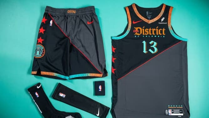
And finally, even though some people refer to the Washington D.C. as "The District," these Wizards jerseys look like something straight out of The Hunger Games districts.
JERSEYS WILL BE BORN UNTIL TOURNAMENT IS OVER
The City jerseys will be worn every Tuesday and Friday beginning this Friday as part of the in-season tournament that ultimately culminates in a playoff-like tourney in Las Vegas in December with each of the winning players receiving $500,000 as incentive to pretend to care about it.
The NBA and Nike believe that the distinctness of the City Jerseys will let viewers know that they are watching the tournament. That is if they are even able to decipher what the jerseys mean and don't continue scrolling through the television thinking it was a college basketball game or something like the Big 3 League.