Hits and Misses From The NHL's Fresh Set Of Reverse Retro Jersey
It's like Christmas for jersey nerds. On Thursday Adidas dropped a brand-spankin' new Reverse Retro jersey for all 32 NHL teams.
If you're unfamiliar, the NHL's Reverse Retro program last appeared during the shortened 2021 season. Each team busts out a jersey from their history — or sometimes local hockey history if need be — and then they give that jersey a remix.
Switch the colors around, mix up some different eras, or just come up with something fresh with a tip o' the cap to the past.
As you'd expect with more than 30 new sweaters being rolled out there were some that hit the mark, and others that weren't even in the right zip code.
Hit: San Jose Sharks
The Sharks might be the big winner of the 2022-23 Reverse Retro jerseys.
San Jose's new sweater is based on one worn by the old California Golden Seals who played in the Bay area from 1967 to 1976.
They didn't overthink this jersey and that's why it's great. They kept the same unique striping and simply put the word "Sharks" in the Seals font. It's simple and effective.
We haven't seen how many of these jerseys will look with helmets, gloves, pants, and socks, but it'll be hard to mess this one up.
It'll also be interesting to see if the Sharks try to pay homage to the Seals' infamous white skates.
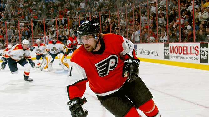
Miss: Philadelphia Flyers
It kills me to say this, the Flyers missed it with these.
It's hard for the Flyers to go back in time because they already wear sweaters practically the same sweaters that they wore when they debuted in 1967. Flipping the black for orange is interesting but it just doesn't do it for me.
The Flyers' previous Reverse Retro jersey was a nod to the club's '80s and '90s unis. This time around they should've given their chrome logo third jerseys from the mid-aughts.
The Flyers missed an opportunity to remix these unusual third jerseys, modeled here by former Flyer Peter Forsberg. (Photo by Bruce Bennett/Getty Images)
I think if the Flyers had gone with black buckets that may have changed it for me.
Still, these were some of the most un-good jerseys of the bunch.
Hit: Chicago Blackhawks and Detroit Red Wings
I put these two Original r clubs together because there seems to have been a little bit of homework copying on these.
Cue that meme of Spiderman pointing to himself.
The plan is for the league to hold some Reverse Retro matchups where each team will where they're new jerseys. Let's assume the Red Wings and Blackhawks will not be appearing in one of those together.
Despite their similarities, these are both phenomenal. Both are nods to jerseys that were on the ice 80 or more years ago.
The striping and the word marks are phenomenal on both,
Now throw on some old school brown pants and gloves then these things could go in the Louvre.
Miss: Carolina Hurricanes
Jerseys are a numbers game for the Hurricanes. They're going to have 6 this year: home, away, third, Whalers, Stadium Series, and now the Reverse Retro. At least one has to be a letdown and the Reverse Retro is that let down.
Throwing it all the way back to 2019...
In fairness to the Canes, they don't have a ton of options. This is just a recoloring of their current road sweater.
They're just very meh. While they got the "Reverse" part down, just not the "Retro" part.
I think I speak for everyone when I say if anything, we were hoping for some fresh whalers duds in Hurricanes colors.
No dice. Maybe next time around.
Hit: Colorado Avalanche and New Jersey Devils
Another pair that seemed to be snooping around each other's ideas, but this time it makes sense: they're paying tribute to the same franchise.
The Kansas City Scouts entered the league in 1974 then moved to Colorado and became the Rockies in 1976. By the early '80s, the franchise moved again, this time to become the Devils.
So, the Avs are paying tribute to local hockey history, while the Devils are honoring franchise history with their new Rockies-inspired threads.
Both absolutely nailed these. My only critique is that one of the two teams should've gone with a dark jersey.
Miss: Anaheim Ducks
The Reverse Retro program is practically made for the Ducks to bring back their old eggplant and jade colors. They did it last time but this time... nope.
The Ducks decided to take their inaugural jerseys and recolor them in their current orange, gold, and black.
It's a bit boring, Honestly, it would've been more interesting to take a modern jersey and put it in their old colors.
At least the team is embracing the Wild Wing logo because that thing is iconic and the decision to bench it is one of the worst marketing decisions in NHL history.
You've got to look at the silver lining.
We'd be here all day if we tried to break down every jersey, but here is the whole collection of Reverse Retro jerseys for this season:
Definitely looking forward to seeing (most) of these on the ice.
Follow on Twitter: @Matt Reigle