Central Michigan University Misses Glaring Sexual Innuendo, Sends Out Extremely Awkward Laptop Stickers
Central Michigan University took a major L this week with one of its promotional stunts. Whomever was responsible did not think things through. Not even a little bit.
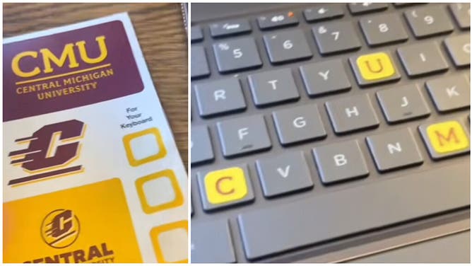
In a marketing ploy to increase fellowship amongst students and alumni, the school sent out keyboard stickers that were intended to highlight its acronym — CMU.

(Photo by Frank Jansky/Icon Sportswire via Getty Images)
However, the university missed a glaring sexual innuendo that was associated with the stickers.
Specifically, it was three stickers with three letters. C, M, and U. They were printed in school colors. The background is gold and the letter itself is maroon.
The three stickers fit perfectly on a standard keyboard. The C sticker goes on the C key. The M sticker on the M key. The U sticker on the U key.
Pretty straightforward.
It was a pretty good idea that could have been a fun little thing for CMU students and alumni in class or at work. Until you look at how the letters are positioned on a keyboard.
If you are currently at a computer, look down at the keyboard in front of you. If you are not, look later.
The C is on the left side. The U and the M are on the right side, with the U positioned slightly above and slightly to the left of the M. As a result, going off of basic United State readership practice, one would typically read the C first, followed by the U and then the M.
Instead of CMU, the stickers spell out... well...
(courtesy: @MKorostoff / Reddit)
This major blunder never should have happened. Somebody, somewhere along the line, should have said "hey, let's think about this for a second." But they didn't. They went through with the promotional stunt, printed the stickers and sent them out.
And now... C-M-U is C-U-M. Oops!